One of the most forward-thinking leagues throughout the world presented its new image. Major League Soccer leaves behind the logo that started everything, presenting a more sober version for the league's crest after eighteen years.
Fully re-designed, the logo leaves out the cleat and the ball that characterized the league during its 18-year existence, and league officials shared their thoughts on what will be MLS' intention with this new logo:
“The new brand’s design is intended to say “soccer” without the literal ball and cleat. In the end, we decided that the inclusion of a ball and cleat is unnecessary as it dates us very quickly (due to the fast pace of innovation in our game) while many other ways exist to signal we are a soccer league."
One of the most interesting features will be that each team will have their own version of the league's logo. To avoid confusion, the same press release ellaborated on the matter:
“It means each club will get a version of the league crest, which better reflects their clubs identity and local market. This is not a replacement for the club brand; instead the new league brand compliments and allows the club to be the real hero. We want to reinforce the ethos of the new brand, which encourages clubs to “own” and adapt the crest to match the colors they and their fans associate with and support.”
The new league logo will be introduced today with the unveiling of the FIFA 15 videogame.
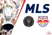
A look at MLS' new crest and the variations for all the teams:
.PNG?q=75&w=634)
Like it? Hate it? Here are some fans' opinions about it!
the new #MLS logo was created just so Henry has something to lean on. #henrying #MLSNEXT @NewYorkRedBulls #RBNY pic.twitter.com/WSq6QzQPKR
— ReadJunk.com (@readjunk) September 18, 2014
"Hey, we're supposed to unveil a new MLS logo today." "Damn, I totally forgot. Give me 20 minutes in illustrator." pic.twitter.com/m5Ii9W77yg
— Dieter Kurtenbach (@dkurtenbach) September 18, 2014
Future MLS CBA negotiating tactic - "we couldn't even afford a full logo, we're so cash-strapped."
— elliott (@Futfanatico) September 18, 2014
The MLS rebranding I really care about is the one awaiting Chivas USA
— Rob Stone (@RobStoneONFOX) September 18, 2014
I like simple/clean look of new @MLS logo. Perimeter tail is a little distracting. But in 6 months nobody will care.
— Alexi Lalas (@AlexiLalas) September 18, 2014